Getting Started With Watercolors - Watercolor Sets for Beginners
July is #WorldWaterColorMonth! -- which makes it the perfect time to share and delight in all things watercolor!
It’s hard to believe that I was actually terrified of watercolors five or so years ago. My early illustration work relied on Copic and Prismacolor markers, and while they’re great at providing vibrant color, they couldn’t replicate the fluid, textural effects that I admired so much in the work of watercolor artists like Bil Donovan, Samantha Hahn and Helen Dealtry.
Getting comfortable with watercolor took some trial and error, in terms of finding the right materials and mastering the right techniques. A lot of pieces of paper with ugly splotches went into the recycling bin. But eventually, with a ton of experimenting and the help of a few tutorials, I came to love the medium. I now create the lion’s share of my work in watercolor.
When you’re getting started with watercolors, half of the battle is learning the right technique for handling the paints. But the best technique in the world can be hampered by not-so-great materials. Experienced artists can definitely make any medium work for them, but my philosophy is always -- why make your work harder? This is why I encourage my students to learn with quality supplies available at moderate prices.
When shopping for watercolors for the first time, you want to buy a set of pans that meets a few criteria. It should have:
a good range of colors to help you learn color mixing;
pigments that are rich and concentrated (not chalky), and won’t become dull and grainy on the paper;
a case with mixing wells that keeps everything compact and organized.
So here are a few suggestions for value-priced watercolor sets that will allow you to explore painting without breaking the bank.
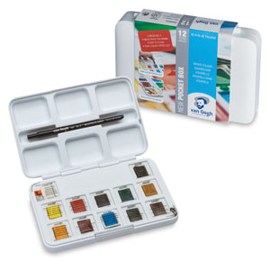
I first experienced this set when friend at an illustration conference used them while taking a painting break. I noticed how easily he was able to mix the pigments and how vibrant the colors were. It wasn’t too long before I grabbed the Van Gogh set for myself, and I’ve got to say, these paint hold up pretty well next to my fancier, more expensive pigments. I adore the small, compact case, with six decent-sized wells for mixing. The 12 hues are more than enough to mix just about any color you need. It comes with a small travel brush, like many sets, but I never end up using it. I’m fine with carrying a few of my own synthetic brushes if I’m painting on the go. These are always my first recommendation for anyone experimenting with watercolor for the first time.
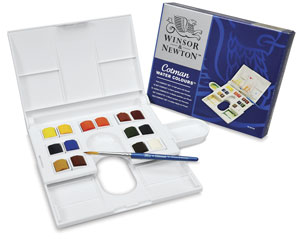
This set was on the supply list for my first illustration classes in fashion design school. I enjoy the Winsor & Newton Cotman set because of its range of colors. With 14 half pans, you get two versions each - typically a warm and a cool - of yellow, red, crimson/magenta, green and blue, plus your traditional neutral colors. It has mixing wells in the lid, as well as two cool pull-out compartments to give you more room for mixing. (I’m embarrassed to admit how long it took me to discover the pull-out palette!) The one big limitation of this set is that the mixing lid doesn’t lay flat. Sometimes the pull-out compartments can be a bit difficult to fiddle with, and I don’t find the colors to be quite as vibrant as the Van Gogh paints. I have used the travel brush that comes with the set, as it’s fairly sturdy. Overall it’s a good set to learn with.
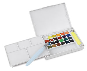
This is my newest set of beginner-friendly watercolors. The Sakura Koi sets are available in 12, 24, 48 and 60-color versions and are truly designed for painting on-the-go, as they come with a few cool features. They include a small waterbrush (which I actually use!) and a pair of in-palette sponges, which allow you to clean your waterbrush between changing colors. It also comes with a fairly large palette that pops out and stands on its own. The 24-pan set provides a wonderful range of colors, though some colors perform better than others. The bright hues, like Lemon Yellow and Permanent Green Pale, come out beautifully vibrant. But others, like the Burnt Umber, are not quite as satisfying. One frustration I have with this set is that the cakes dry out fairly quickly, so I have to continually re-wet the colors while working. Still, you can’t beat the value of getting so many good-quality colors with a handy waterbrush to boot.
I have my favorites, but honestly, you can’t go wrong with any of the options above. The availability of good-quality, value-priced art supplies makes it easy to experiment with new techniques and materials. If you’re trying out watercolors for the first time, make sure to also pick up a pad of watercolor paper, to get the most out of your new paints!
And if you want to learn more about #WorldWatercolorMonth, check out the details here. Happy painting!
FTC NOTICE: This post contains affiliate links, from which I earn a small commission. All opinions are my own. I only discuss products I have used, and only endorse products that I truly enjoy.
Flashback | A Collection Inspired By... Light Fixtures?
I probably made my first foray into surface design for clothes when I was kid - in fact, I know I did. My art supply box had just as many colors of puffy fabric paint as it did Crayola crayons. And every year in elementary school, we spent a whole day decorating Christmas tree sweatshirts in puffy paint and pom-poms to wear during the holidays. Later, as a teen, I’d paint personalized placement graphics (you know, my name, my zodiac sign, lol) on tank tops I’d made while learning how to sew.
But I didn’t truly get a sense of what textile design was until I took a class in the fashion design program at Drexel with my professor and advisor (and now colleague!) Kathi Martin. There I learned all about repeats, colorways, conversational prints, and of course, the enduring importance of florals.
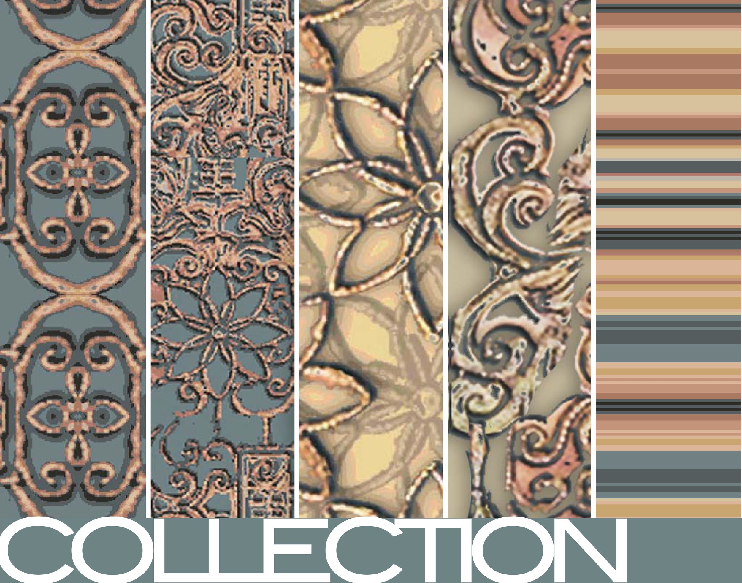
One project challenged us to manipulate inspiration photographs into pattern designs. So on a visit home to my childhood home in Pittsburgh, I took photos of the unusually ornate light fixtures. They always stuck out in an otherwise modest 1920s house -- plus, I’ve always loved the look of filigree.
Back in Philadelphia, I experimented both in Photoshop and another textile design program (that I regrettably can’t recall the name of!) to create mirroring and kaleidoscope effects with my photographs. The result was a collection of prints in a palette of deep, muted teals, gold, creams and warm browns.
I had so much fun with this collection (and loved the color palette so much!) that when it was time for my husband and I to move into our first apartment, I had one of the patterns printed on durable canvas to reupholster the dining room chairs we found in a thrift shop. (Sadly, those chairs were already extremely old and didn’t make it with us to the new apartment four years later. RIP.)
It still have some of the fabric, which I printed with Spoonflower, lovingly tucked away in my home fabric closet. It might be fun to use to create some pouches, or maybe even a tote! It’s always fun to make something new out of an old project.
Collection Inspiration | TERRAZZO TEXTURES
For our honeymoon, my husband I spent a week in Curaçao, a beautiful island in the southern Caribbean. We’ve visited our fair share of romantic destinations, but Curaçao, for me, has remained one of the most inspiring. From the clear Caribbean waters, to the tropical plant life, to the delicious food, colorful architecture and delightful people, our short week there has stuck with me for years.
So when I decided to experiment with the popular terrazzo trend, I went back to my visit to Curaçao for some added inspiration. I’ve always loved the assortment of colors in east Willemstad’s shopping district, and drew my color palette from that iconic waterfront.
The sunshine yellows, salmon pinks and light aquas pop against the deep blue of the ocean. (And in fact, the combination delights me so much that my husband and I brought home a painting of east Willemstad that now hangs in our living room.)
With my color palette in place, I started playing around with the textures of terrazzo. There is the classic pattern, of course, with shards of multicolored material sprinkled about a surface like freshly-thrown confetti. But I also wanted to play with those shapes different ways - what if I made them very tiny? Extremely large? Abstracted them, pushed them closer together and arranged them by color.
The result is a collection that was a ton of fun to paint. It gave me the opportunity to play with scale, color and shape, using two sources of inspiration that I absolutely adore. I envisioned outfitting a home in these patterns, bringing a little bit of the excitement and color of the Caribbean into the living room.
Living room visualization using the Terrazzo Textures Collection.
These patterns are currently available for purchase or licensing. To inquire about licensing or purchase, contact me at illustration [at] veronicajamisonart.com
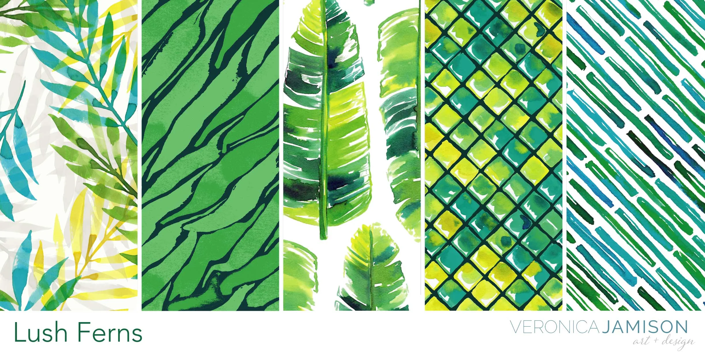
Collection Inspiration | LUSH FERNS
Prints featured - Top left: Layered Ferns. Bottom right: Water Waves. Inspiration images via Pixabay.
I have to admit, when I was a kid, I didn’t fully understand why my grandmother filled her Brooklyn apartment to the brim with all kinds of plants. “How does she water all of these?” is what I wondered the most. But it turns out that Grandma was simply decades ahead of the modern trend of bringing the outdoors inside. (A visionary, she is.) And now that I’m good and grown and committed to personal wellness, I totally get it.
Few things are as relaxing and serene as the company of lush greenery, especially if that greenery is lovely, large and leafy. Even better - relaxing in a sunny, plant-filled filled room as the air and the light pour through an open window. (I may be reminiscing about my stay in beautiful flat one summer in Barcelona).
Green leaves and warm surroundings were the inspiration behind this collection of hand-painted watercolor patterns. I’m particularly a fan of lush green combined with sunny yellows and cool teals. The botanical patterns are paired with saturated watercolor geos for a bright, tropical vibe.
To see more of the Lush Ferns print collection, check out my pattern gallery here.
For licensing and purchasing inquiries, please email illustration [at] veronicajamisonart [dot] com.
3 Great Books to Help You Learn Fashion Illustration
Teaching fashion illustration has become one of my great joys, and I'm always happy to provide my students and other budding artists with info on how to get started. Here, I’m sharing my favorite illustration books for beginners.
All of these live on my bookshelf, and I still refer back to them regularly for tips, tricks and techniques. They’re all available on Amazon and range in price from super affordable to super-investment, so you’ll be able to find one to fit your needs no matter what your budget. Oh, and a disclaimer, because this is a thing now: this list is not sponsored or a paid for by anyone in any way — these are just truly some of my favorite fashion illustration books.
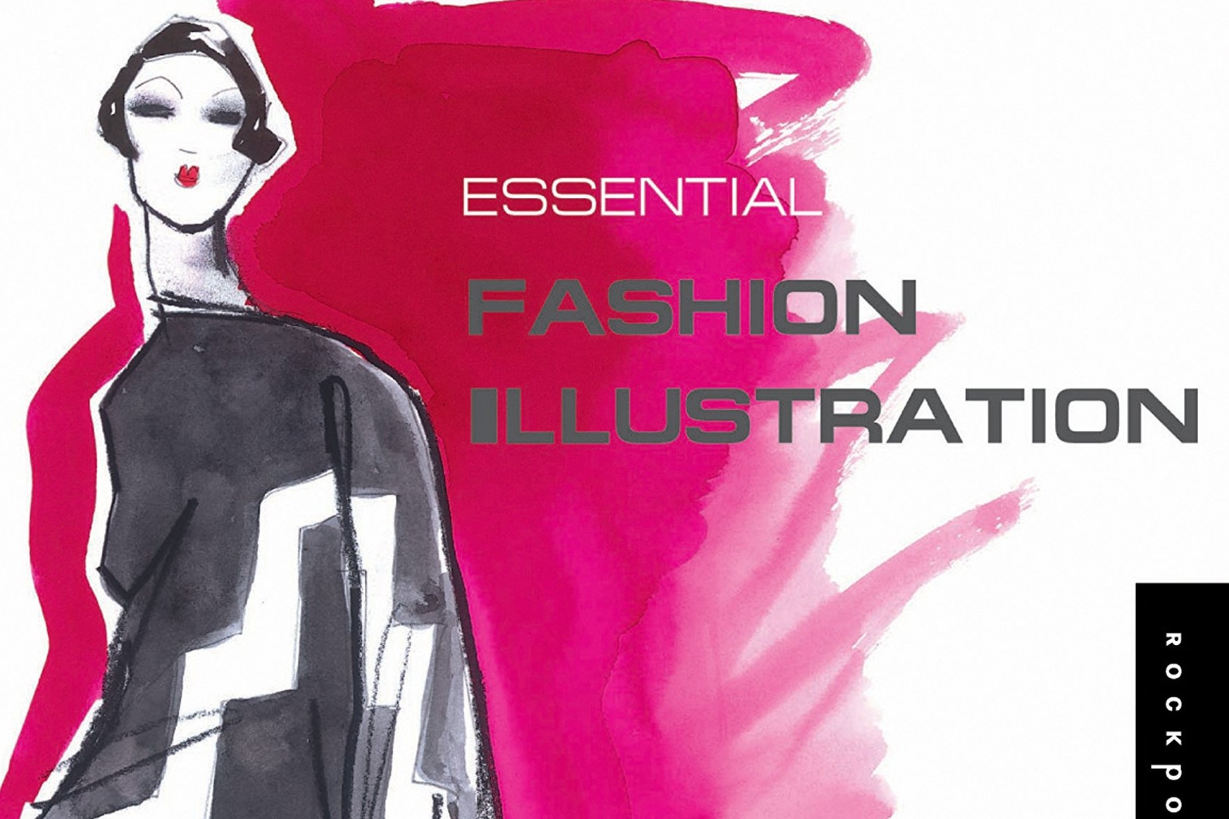
1 | Essential Fashion Illustration by Maite Lafuente
Budget: $
I can’t even remember when I purchased this book — probably when it was first published in 2006, so it’s been on my shelf for almost a decade. This slim, lightweight manual covers all the important basics in learning how to draw a fashion figure, from proportions to poses to the perfect fashion face. There are a myriad of poses to learn from, and it examines different parts of the fashion figure (such as arms, legs and feet) in great detail, helping you to draw them at every angle. The best part: It’s SUPER affordable, and you can usually find it in any major bookstore with an art and design section. (In fact, I’ve never NOT seen it at a Barnes & Noble). Amazon even has copies for as low as a penny, so if you snag one of those, you’ve definitely gotten a great deal.
2 | 9 Heads by Nancy Riegelman
Budget: $$
This is a fashion school bible. Nancy Riegelman has been teaching fashion illustration for literally decades, and her book on the subject is used in college curriculums across the country. And with good reason — this is probably one of the most comprehensive fashion illustration books you’ll find. It starts with the body, then goes into very specific detail about drawing faces, hair, clothing, fabric textures and even facial features according to ethnicity. You’ll also see instructions on how to accurately color (or “render,” as we say in illustration) skintones and fabrics so they look authentic. This is NOT a book that can travel with you — it’s very large and quite heavy, but it’s definitely an key reference book to have on your shelf.
3 | Fashion Illustration for Designers by Kathryn Hagen
Budget: $$$
When I decided to get really serious about fashion illustration — but before I was able to enroll in school — I decided to invest in buying this textbook. Fair warning – it is a pricey book (it’s a textbook, you know!... though you can now find used versions that are not as expensive.) I knew it was a book that’s also used for college curriculums, and I knew it would take me step-by-step through learning illustration, from beginner skills to more advanced techniques.
While this is a great textbook — it’s very easy to read and navigate — it’s not quite as comprehensive, in some places, as 9 Heads. However, there are three key things that make it a great book to have: 1) There are exercises at the end of each chapter to help you build your skills; 2) Newer editions have a chapter on using Photoshop to enhance your drawings; and 3) there’s a bonus DVD! The DVD has great video of the author showing you her rendering techniques in real time. It’s just like sitting next to an instructor while they work. (You can see an example of one of the videos here on YouTube.)
So there they are, three books to help you get started in fashion illustration. I hope these help! Do you already have any of these books — or other fashion illustration texts? What are your favorites? Let me know in the comments.


